CSS实现溢出显示省略号

小伙伴们,对于省略号呢,咱们前端攻城狮的实现方法可就是多种多样了,那接下来呢我就给你罗列一下如果用css书写这些特殊效果,来一起看看吧~~~

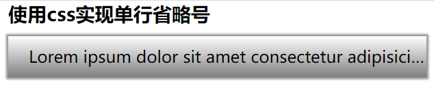
### **1.单行文本超出显示省略号**
效果图:
实现代码:
HTML部分
```html
使用css实现单行省略号
Lorem ipsum dolor sit amet consectetur adipisicing elit. Ipsam ipsaexplicabo quos sapiente ea error, mollitia necessitatibus animi facere rem non sed velit aperiam laboriosamdebitis. Quae deleniti doloremque nisi.
```
CSS部分
```css
h3 {
padding-left: 10px;
}
.a1 {
text-decoration: none;
color: #000;
padding-left: 20px;
}
.box1 {
height: 40px;
line-height: 40px;
background-image: linear-gradient(white, gray);
box-shadow: 0 0 2px 2px rgb(148, 145, 145);
box-sizing: border-box;
/* 单行显示省略号 */
overflow: hidden;
text-overflow: ellipsis;
white-space: nowrap;
}
```
注:此案例为京东首页的部分切图,此时的省略号可以用上述代码实现
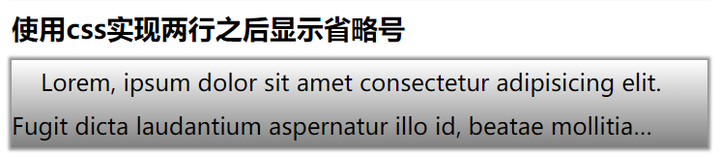
### **2.多行显示省略号**
效果图:
HTML部分
```html
使用css实现三行之后显示省略号
Lorem, ipsum dolor sit amet consectetur adipisicing elit. Fugit dicta laudantium aspernatur illo id, beatae mollitia magnam, laboriosam cupiditate harum veritatis ullam delectus adipisci quasi, laborum ipsum quis est molestiae.
```
CSS部分
```css
h3 {
padding-left: 10px;
}
.a1 {
text-decoration: none;
color: #000;
padding-left: 20px;
}
.box2 {
height: 60px;
line-height: 30px;
background-image: linear-gradient(white, gray);
box-shadow: 0 0 2px 2px rgb(148, 145, 145);
overflow: hidden;
/* 三行显示省略号 */
display: -webkit-box;
-webkit-box-orient: vertical;
-webkit-line-clamp: 2;
}
```
实际案例应用场景说明:
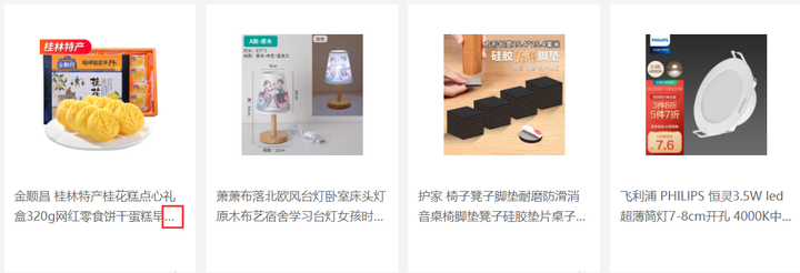
注:此时明显是折行后在第二行多余的部分显示省略号,那由于内容不固定字数不固定,所以需要动态设置,那么就应用到了上述的多行显示省略号的方法
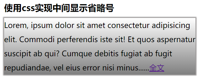
### **3.内容中间显示省略号(方法一)**
效果图:
HTML部分
```html
使用css实现中间显示省略号方法一
Lorem, ipsum dolor sit amet consectetur adipisicing elit. Commodi perferendis iste sit! Et quos aspernatur suscipit ab qui? Cumque debitis fugiat ab fugit repudiandae, vel eius error nisi minus全文
```
css部分
```css
.box3 {
/* height: 120px; */
line-height: 30px;
background-image: linear-gradient(white, gray);
box-shadow: 0 0 2px 2px rgb(148, 145, 145);
}
.box3 span::after {
content: '......';
}
```
实际案例应用场景说明:

### **4.内容中间显示省略号(方法二)**
效果图:
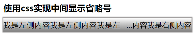
HTML部分
```html
使用css实现中间显示省略号方法二
我是左侧内容我是左侧内容我是左侧内容
```
css部分
```css
.box4 {
height: 30px;
line-height: 30px;
background-image: linear-gradient(white, gray);
box-shadow: 0 0 2px 2px rgb(148, 145, 145);
}
.box4 .span1 {
float: left;
width: 62%;
height: 30px;
line-height: 30px;
overflow: hidden;
}
.box4 a {
color: #000;
}
.box4 .span2::before {
content: attr(title);
width: 38%;
float: right;
overflow: hidden;
text-overflow: ellipsis;
white-space: nowrap;
direction: rtl;
}
/* 优化两个span中间的间距 */
.box4 {
text-align: justify;
}
```
实际案例应用场景说明:
综上所述:以上四种方案是目前页面中应用较多的实现省略号的方法,仅代表个人观点,如您有更优的方法欢迎联系我们。更多关于“html5培训”的问题,欢迎咨询千锋教育在线名师。千锋已有十余年的培训经验,课程大纲更科学更专业,有针对零基础的就业班,有针对想提升技术的提升班,高品质课程助理你实现梦想。